Enhance user experience for ticket vending machine - Product Service Design
Data-Driven Solution I Experience & Accessibility Design I User Research

Overview
German commuters face frustration and delays due to the complex, inefficient ticket vending machines currently in use. My challenge was to create a streamlined, user-friendly solution that improves the interface, simplifies navigation, and enhances usability, with a strong focus on accessibility and inclusivity. Without these improvements, incorrect judgments could be made, potentially making the community unsafe for its users.
Key deliverables
Field research report
Process flow map
Rapid Wireframes
High-Fidelity Mockups
Usability test plan
Low-fi Mockups
Interactive Prototype
Methods
Contextual Research
Data Gathering and Analysis
Exploratory Research
Journey Mapping and Blueprint
Process Flow
Rapid Prototyping
Test and Evaluation
My Role
Sole Product Designer
Team
Catherine Klaus - PM
Duration
3 Months

DISCOVERY
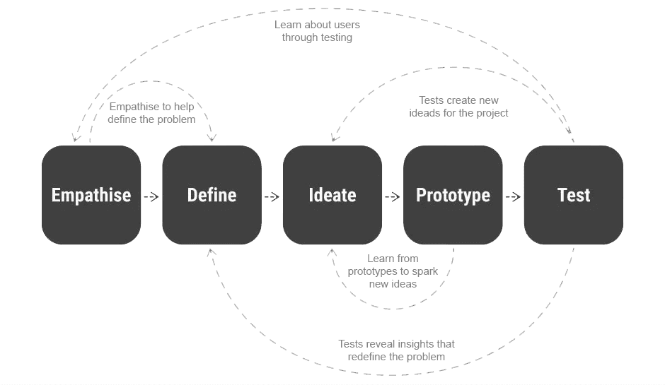
Design Process
I adopted a problem-solving approach and utilized the principles of design thinking linear method to gain a better understanding of the user behaviour, question preconceptions, reformulate the problem and discover valuable insights, strategies, and solutions.
01. EMPATHISE
1.1 Contextual Inquiry and Usability Testing
I adopted a problem-solving approach and utilized the principles of design thinking linear method to gain a better understanding of the user behaviour, question preconceptions, reformulate the problem and discover valuable insights, strategies, and solutions.
User Interviews: 19 planned and 59 guerilla
Who is the user, their needs, goals, motivations, behaviours, frustrations?
At what time does the user use the machine?
What are the user’s travel habits?
Usability Test : 30 Users
How do they operate the machine?
Are there any points of friction and what are those?
What does the user think and do at every step while interacting?
How long does it take to perform each task on an average?
On-field Survey: Rating with 34 commuters
How does the user feel about their experience interaction with the machine, if they’ve used it before?
1.1 Contextual Inquiry and Usability Testing
I gathered the data obtained from the contextual inquiries and survey and organized it using Excel to facilitate the compilation of generative and evaluative research insights. This enabled me to derive quantitative findings.

1.3 What did commuters say in Deutschland? - Marco Level Research

02. DEFINE
Content

Content

Content

Content

03. IDEATE
Content

04. PROTOTYPE
Content

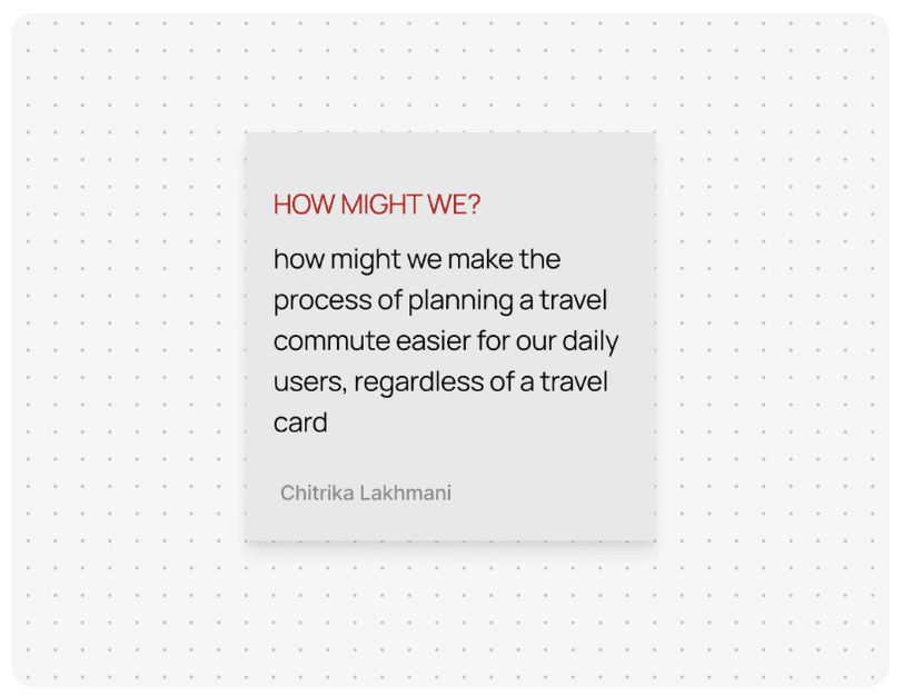
To help users differentiate between the departure and destination fields, it is necessary to increase the prominence of the destination field, as users are currently struggling to distinguish between the two fields
The conflicting styles of the CTAs are causing confusion among users, and there is a need to improve the hierarchy to provide greater clarity
*I was tasked with focusing on Interaction and Usability Experience, while the client’s team handled UI Design, including branding colours, components, and fonts.
Content
05. TEST
Content
Observations
All seven users were able to successfully complete all six task flows
Once users became acquainted with the interface, their interactions during the second task were faster and more comfortable
Potential Future Opportunity
Due to limited bandwidth, the stakeholder team has decided to prioritise additional features for inclusion in the second phase. Such as:
New payment method, allowing users to make contactless digital payments
Additionally, users can now use both their travel card and credit card for payments in situations where the travel card has insufficient funds
Contactless payment options. ETC
Results and Key Takeaways